
Case study
Magnolia
Japanese flavours, made to linger.
- Business
- Japanese restaurant
- Location
- London, United Kingdom
- Project price
- €450
- Delivery
- 7 working days
- Revisions
- 3 rounds
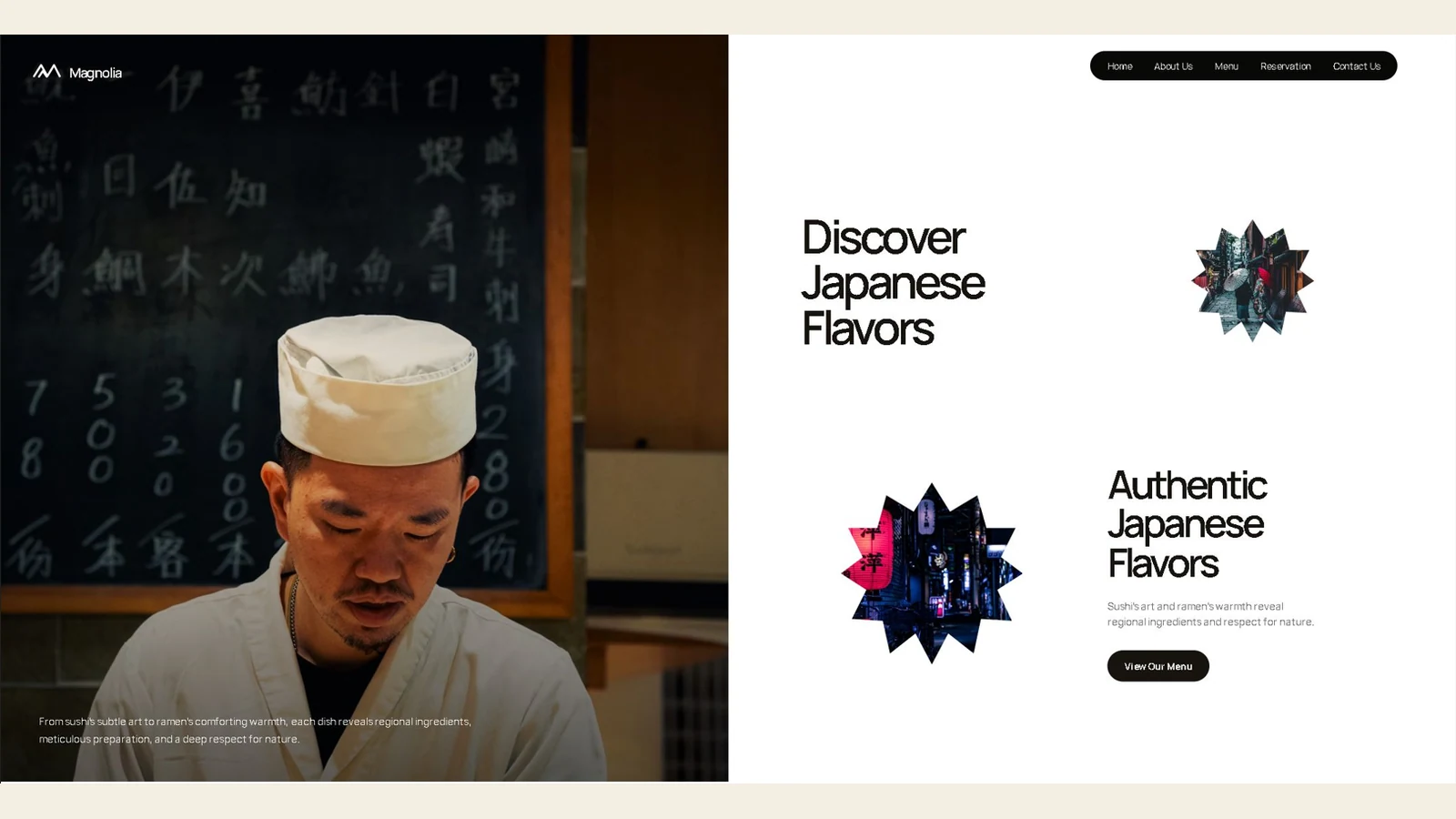
The brief
Bring appetite, atmosphere and a direct reservation route into one composed digital room.
Customer behaviour
Food needs to feel sumptuous without obscuring times, menus or the booking action.
What the page needs to do
A soft-cream, dark-ink restaurant direction where dish photography and restrained editorial pacing make reservations feel like part of the experience.
What we solved
Every piece has a clear customer job.
Practical proof, clear choices and one useful next step set the rhythm for this direction.
- First impression
Let dish imagery establish appetite before the copy begins.
- Service clarity
Use paper-toned space and fine rules to make the menu feel considered.
- Contact / booking path
Keep Reserve visible at every key pause in the story.
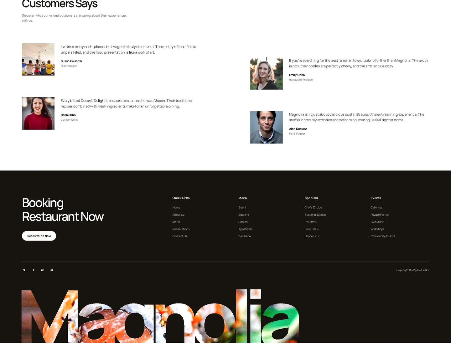
Website proof
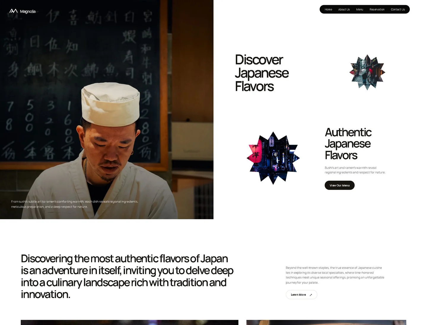
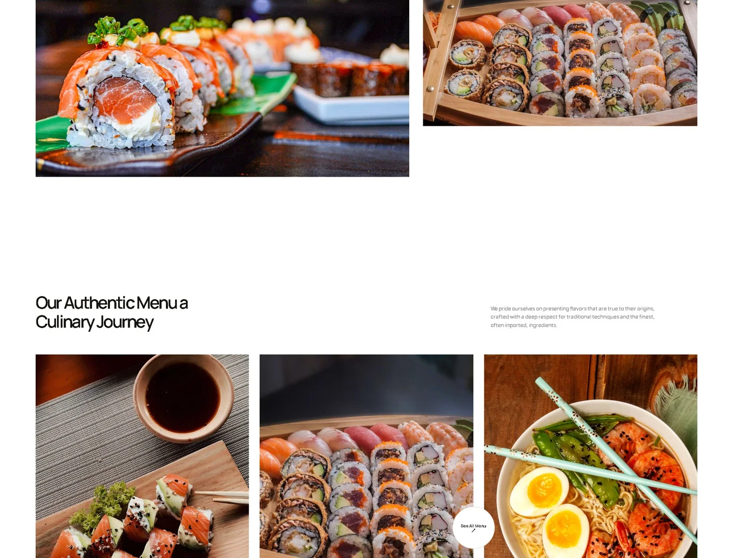
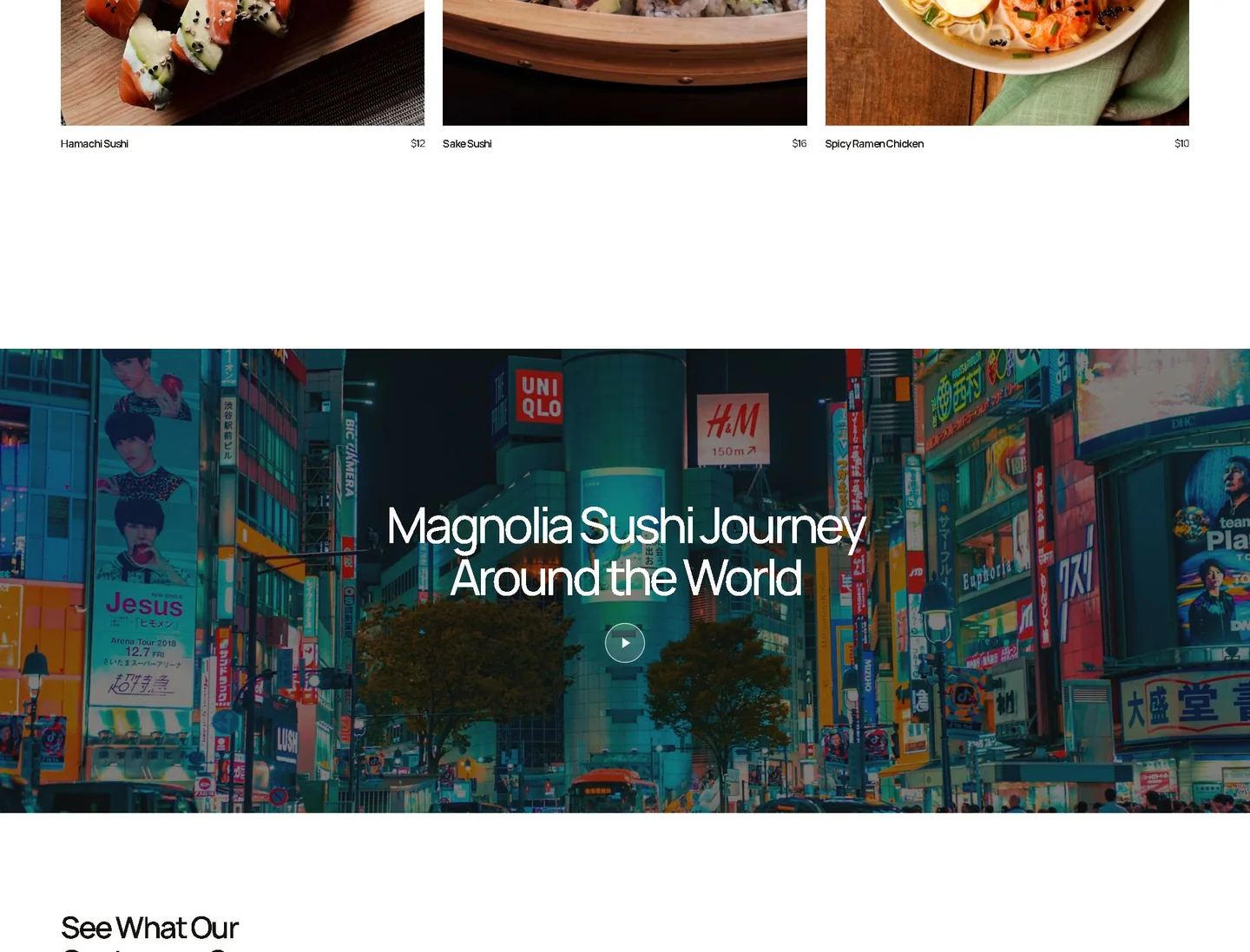
One complete page. Two deliberate canvases.
Switch between the approved desktop and mobile views without leaving the case study.
Client feedback
“The website carries the atmosphere of the restaurant while keeping the menu and reservation path effortless.”
Magnolia · Project feedback
See the full direction
Explore the website from top to bottom.
Switch between the true desktop and mobile homepage captures in a focused preview.